
Yelos is an advertising company with over twenty years of experience in promoting commercial brands. Yelos developed a series of different logos during its first 20 years, but none of them effectively represented the vision of this great company.

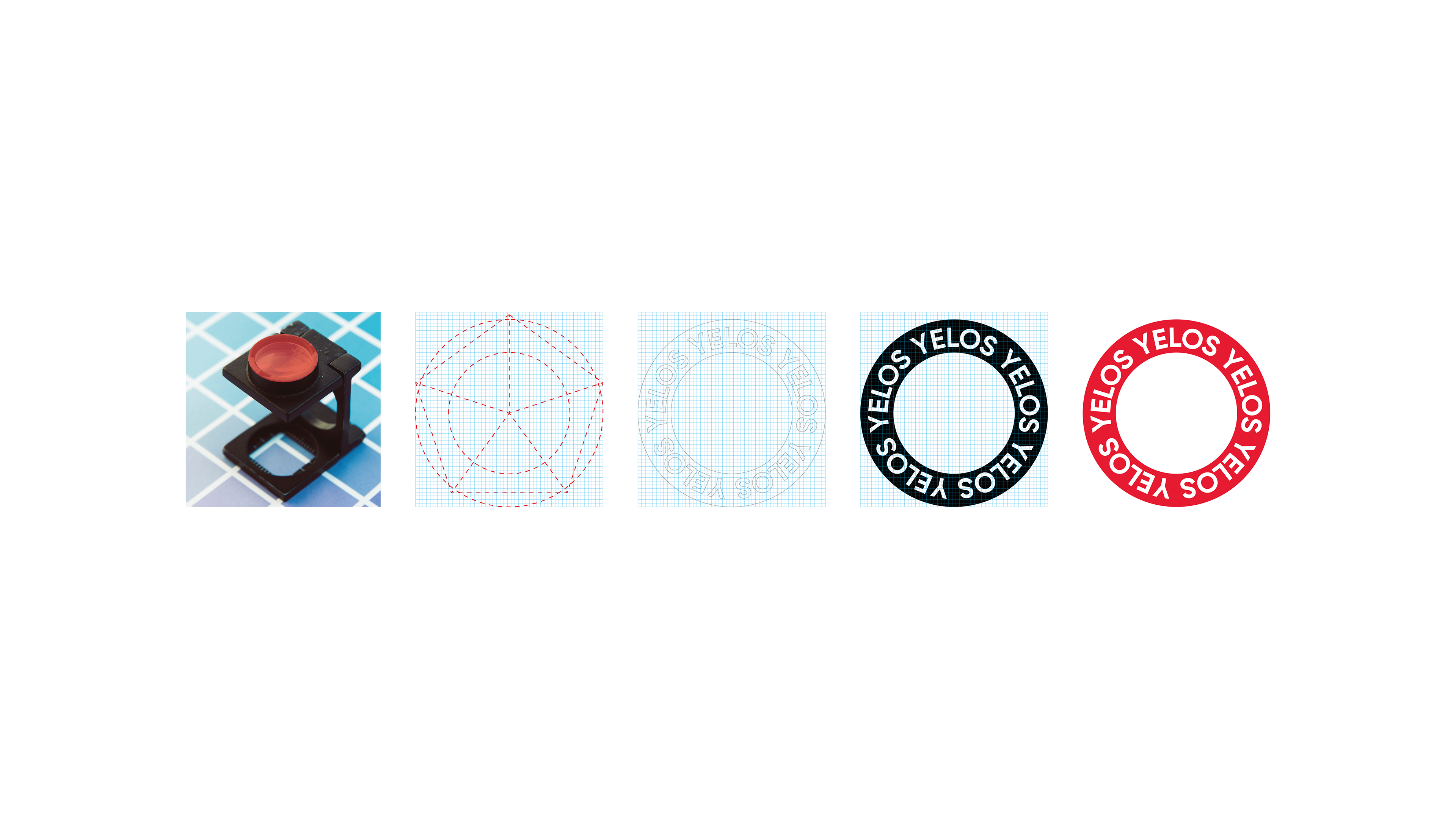
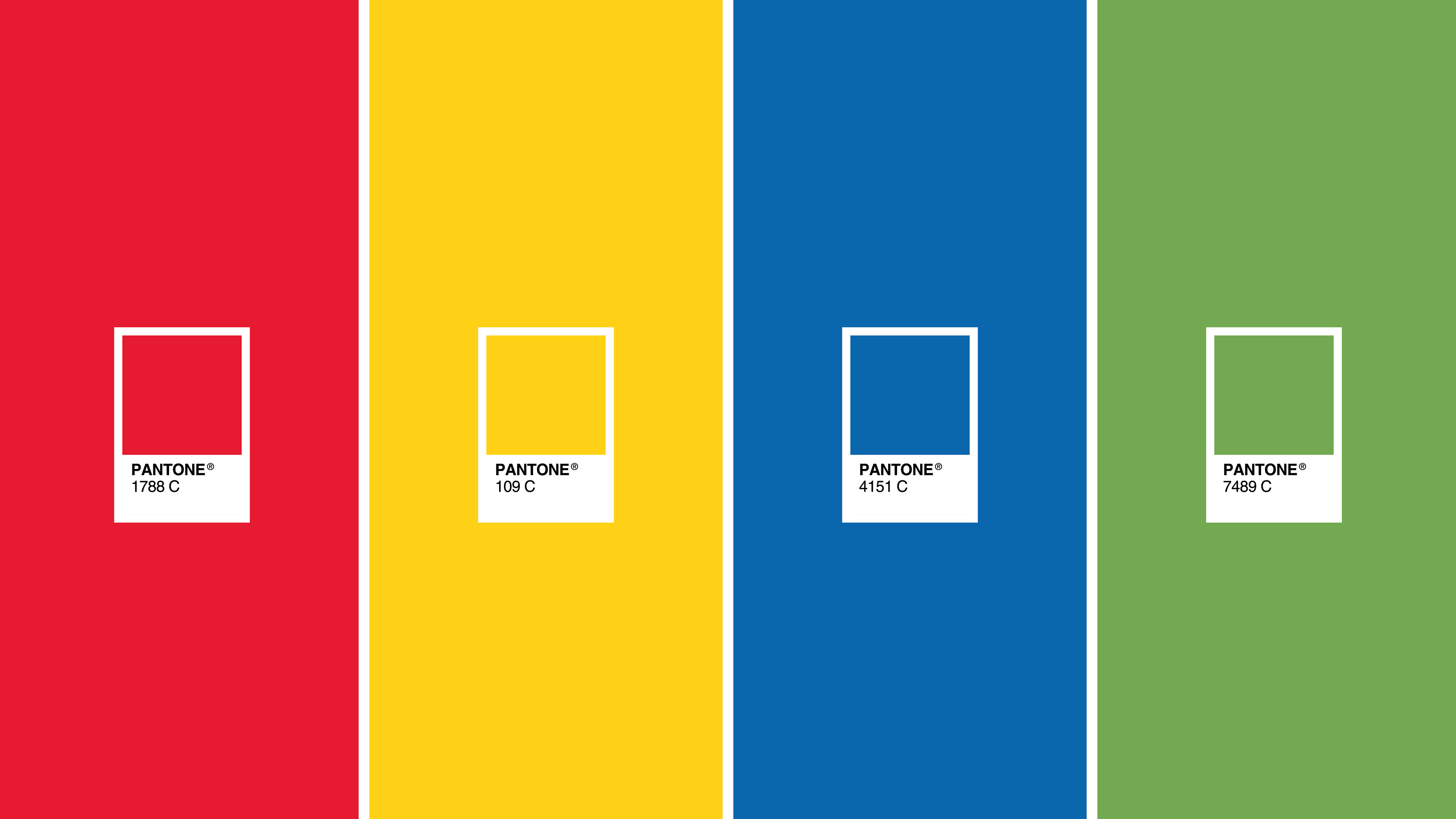
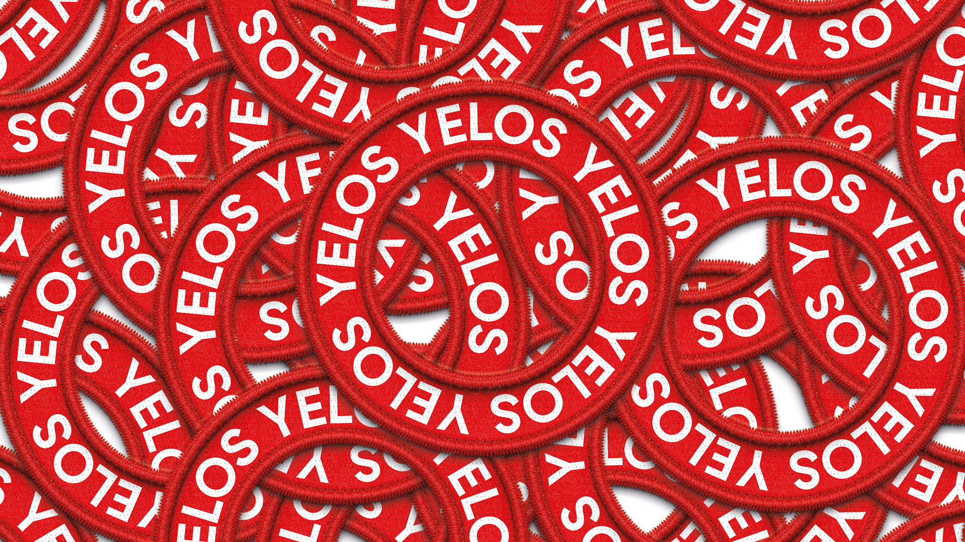
The development of this red ring with the company's name represents the vast world of advertising and promotional items. The color red was chosen because the company is a leader in the field, positioning itself as the number one company in its sector in México. However, we also proposed three other color tones to distinguish the advertising universe, which are: Textile, Printing, and Screen Printing. The symbol was designed to be simple, easily recognizable, even in small spaces. We also aimed
for this logo to be applicable in digital formats, making it a perfect symbol for pixels.
for this logo to be applicable in digital formats, making it a perfect symbol for pixels.